
Dr. Eric App
Clinical Trial investigating if an iPad app increase condom usage amongst sexually active teenage boys
Services
UI, UX, Prototyping
year
2021-22
Link
n/a
About the Client
https://cuimc.columbia.edu
Dr. Lauren Chernick, an emergency pediatric physician and researcher at CUIMC – Columbia University Irving Medical Center, one of the premier research hospitals in NYC.
The Brief
The challenge was to convey sexual health information in a way that was not only accessible and engaging to teenage boys, but actionable in the truest sense. Condom use was measured with self-reported surveys before and after the program.
While the challenge was significant, we also had the unique advantage of being able to rely on scientific research as a part of our design practice. Dr. Chernick had previously run multiple studies to understand the problem space and validate the approach of the app.
The research methods were extremely similar to how I would run early user interviews to assess product-market fit (but far more quantitatively rigorous).
Discovery
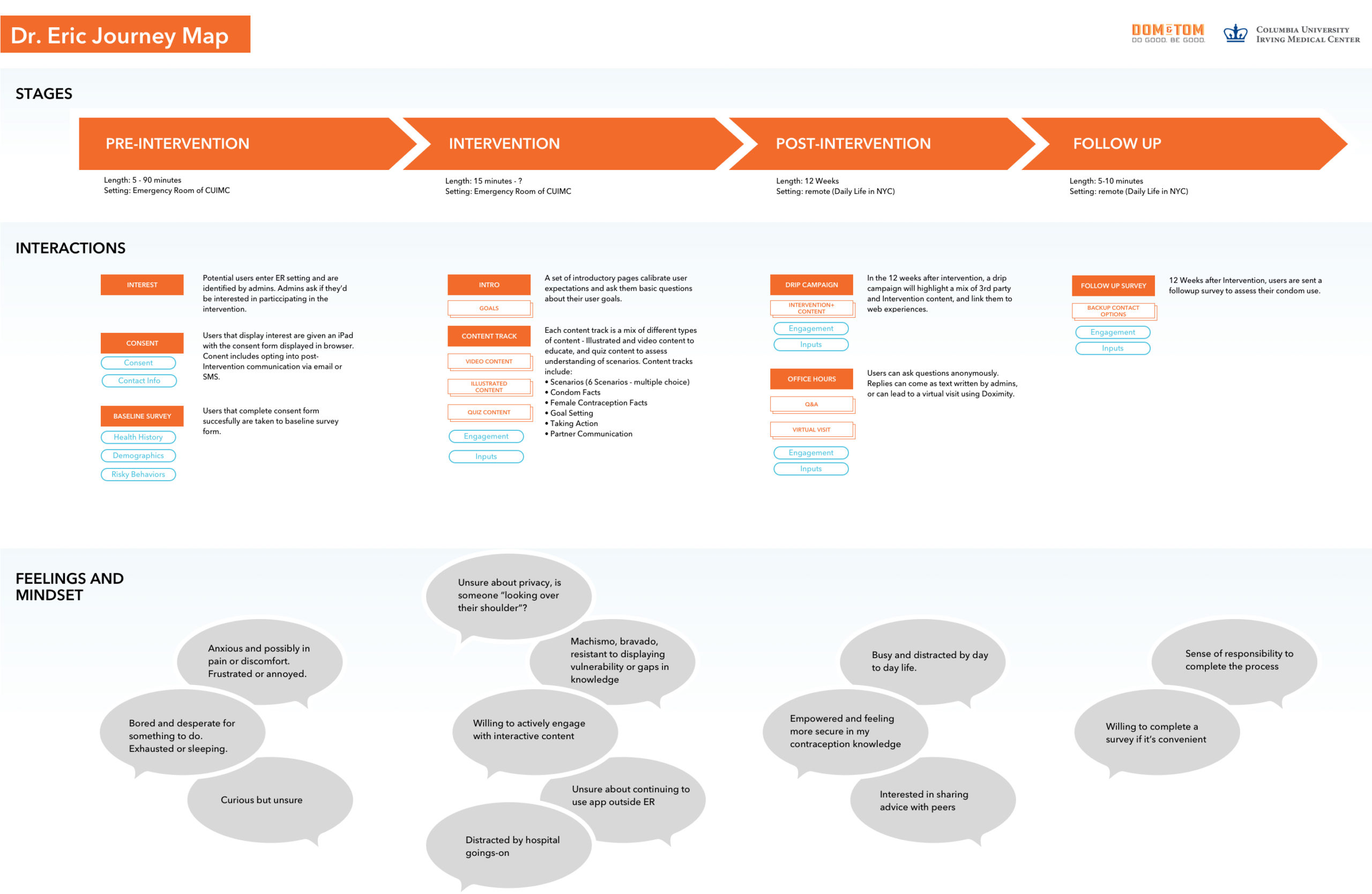
I started by reading the existing research, and conducting Discovery interviews with Dr. Chernick and her team. Then I produced a journey map to visually represent the on- and off-screen experience for users, as well as the feelings and mindset of users.
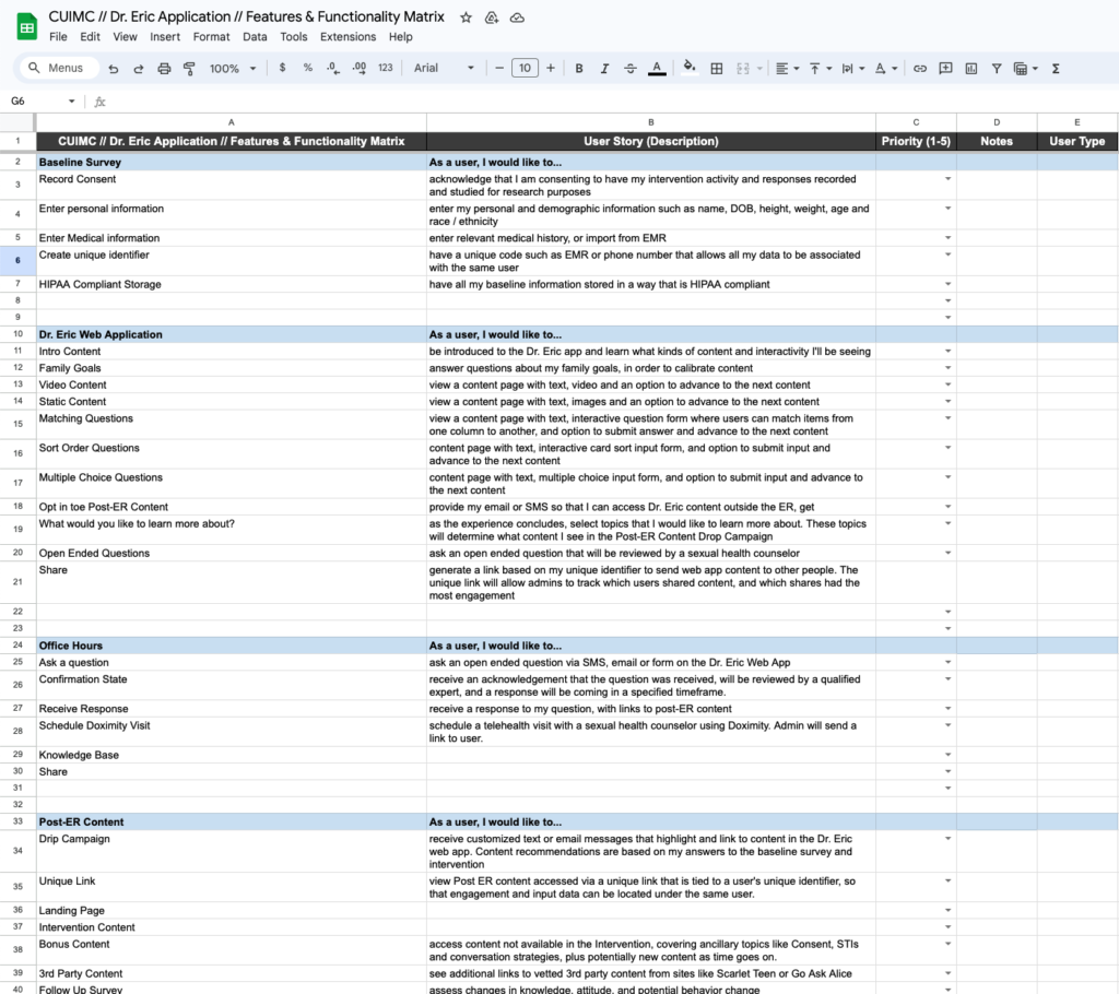
Next, I translated the content deck into a series of user stories captured in the spreadsheet shown below.
With such a content-heavy app, many screens use the same template. To accurately assess the number of unique designs we would need, I created an inventory of all the pages, based on the content deck.
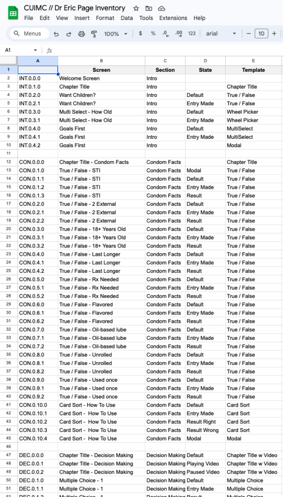
From this I determined there were only 8 templates and 5 additional unique pages needed.
Design
Based on my Discovery work, the visual designer started laying out pages and creating Look & Feel options. We collaborated with Human Factors experts at CUIMC, testing two Look & Feel options.
About halfway through this process, our remote visual designer ghosted us! This could have been intimidating, but with the visual designs and wireframes already locked in I was able to keep the project on schedule.
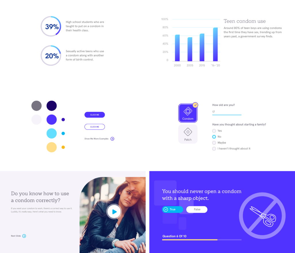
The Dr. Eric App
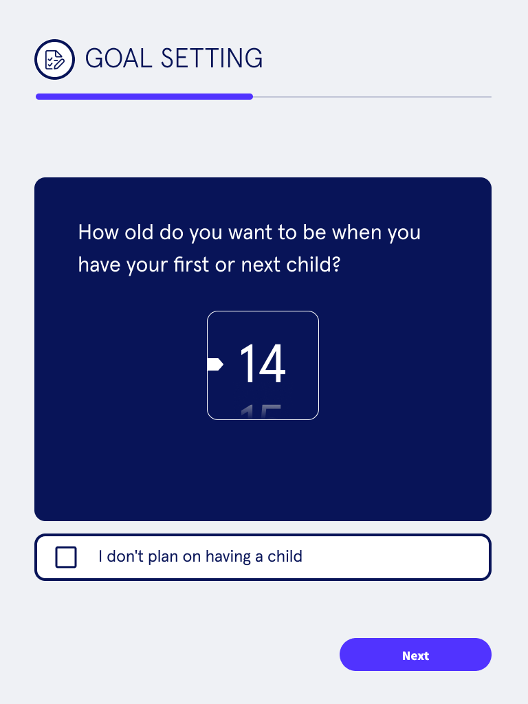
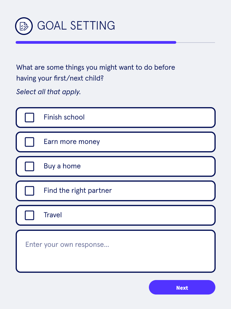
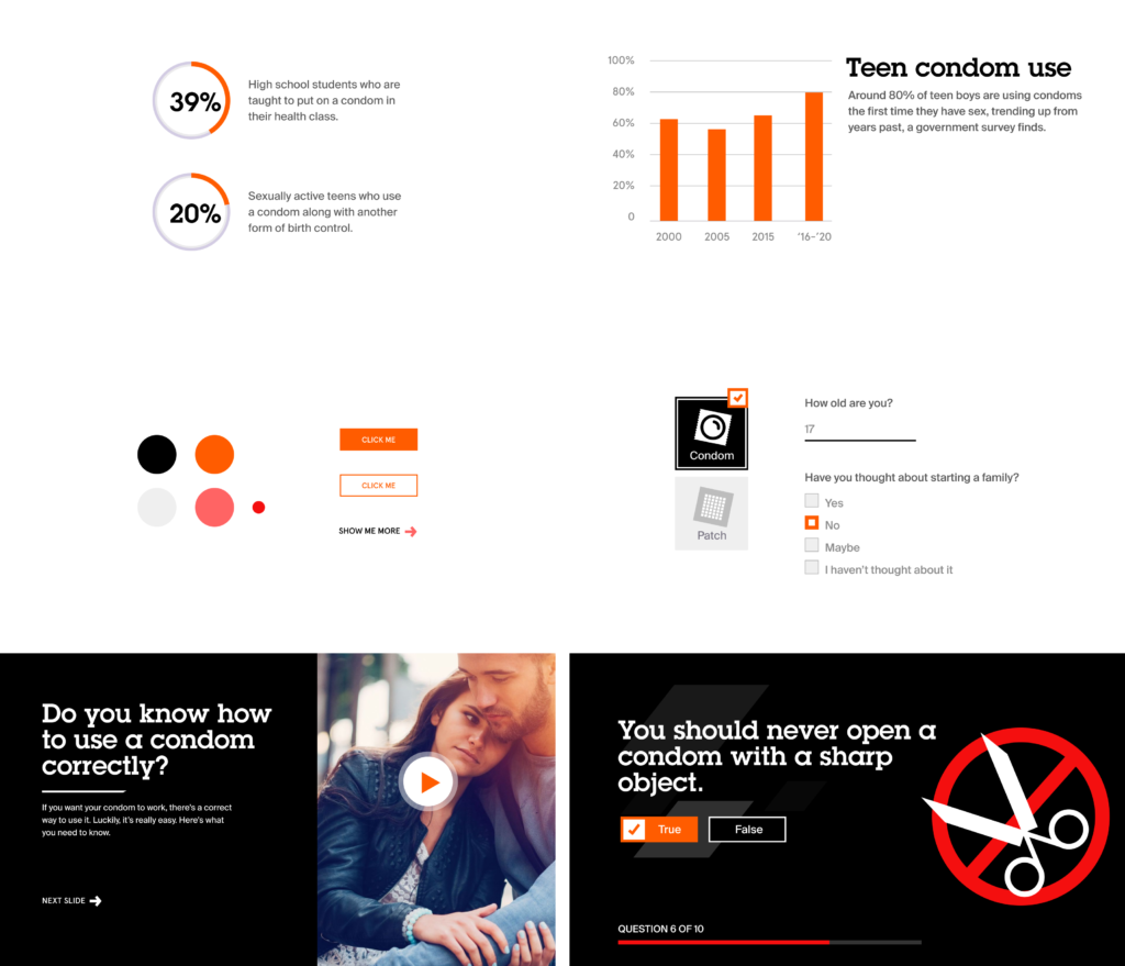
Part 1 of the app was a survey about user’s life goals, based on the Motivational Interviewing method.
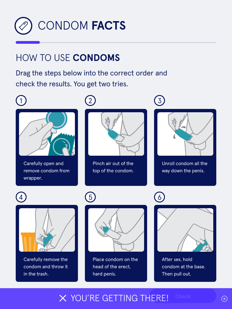
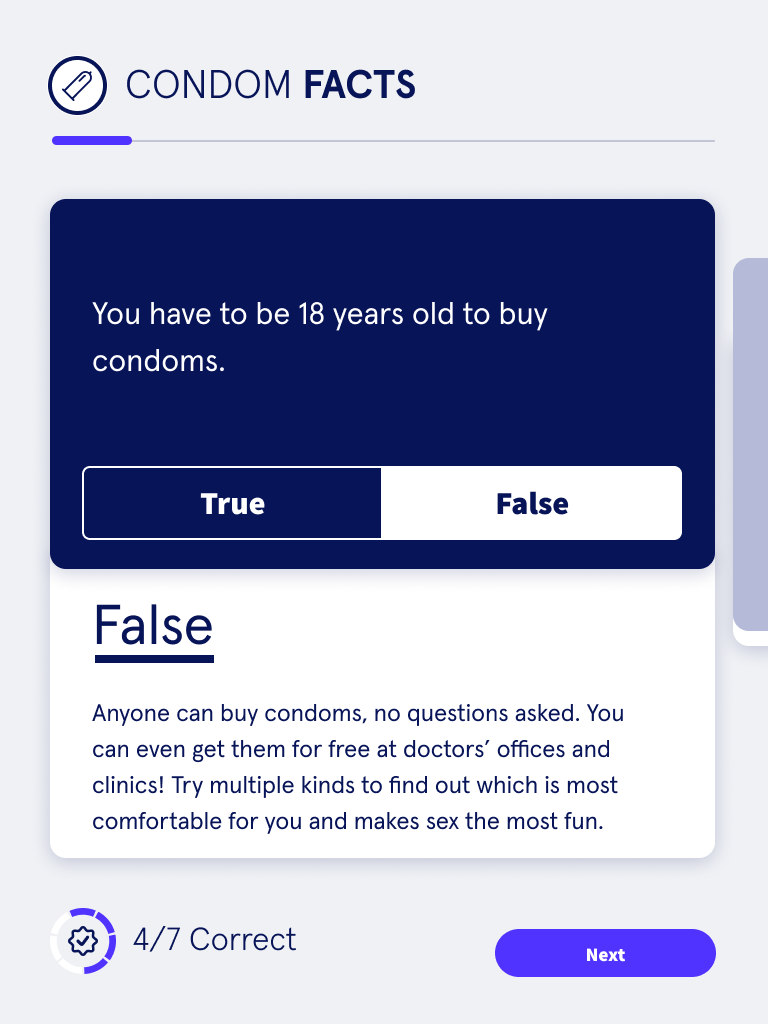
Part 2 was about basic condom education. A card sorting game helps users to think critically about the correct order of operations for condom usage. True / False questions help bust common misconceptions.
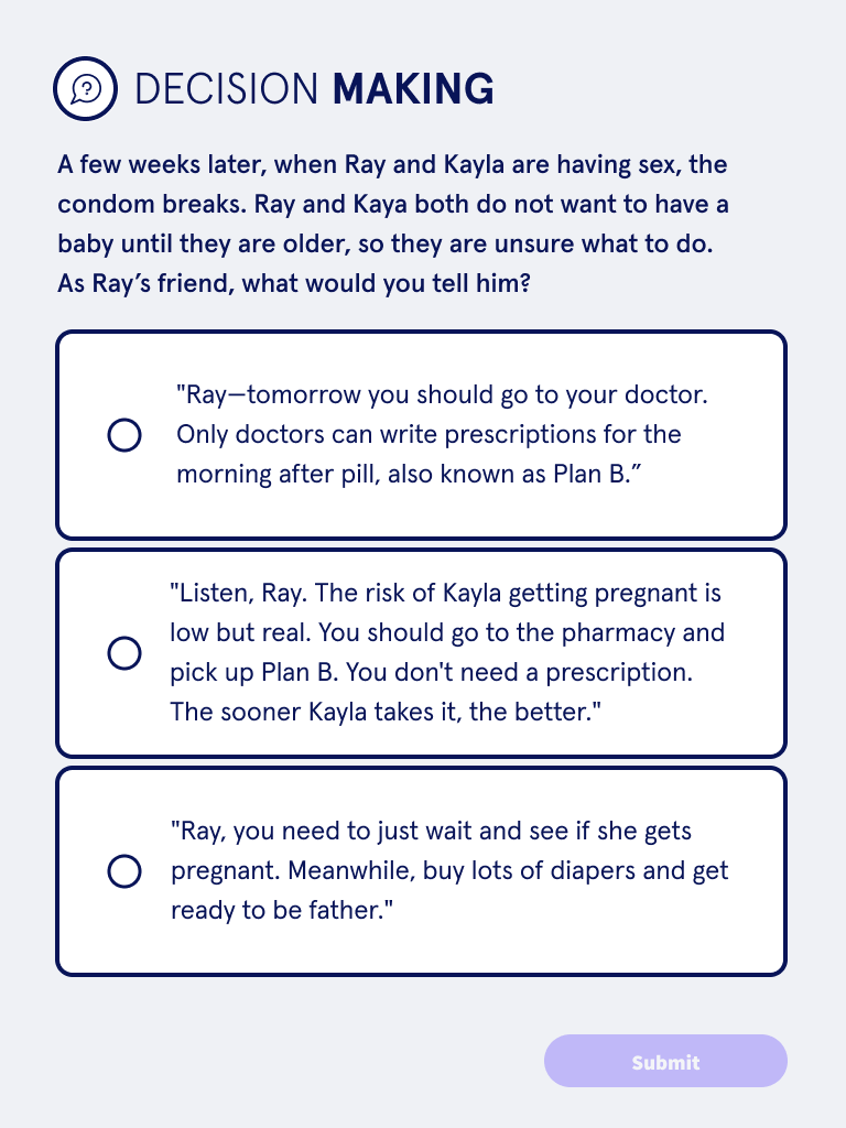
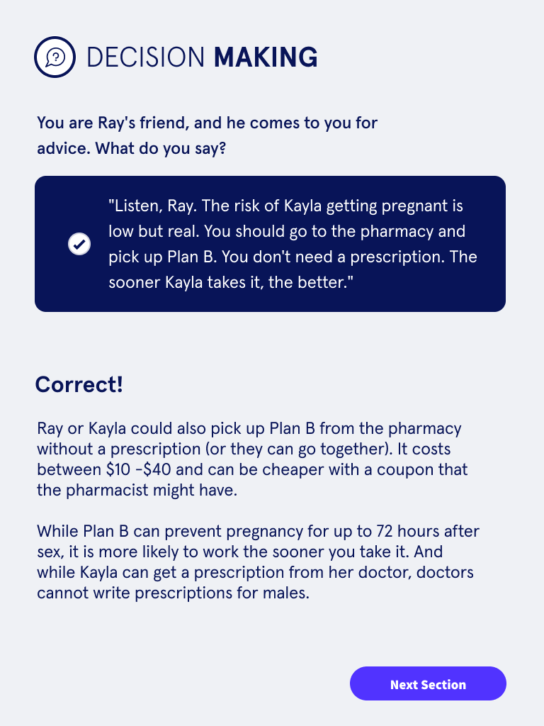
An important insight from user research was that teenage boys were motivated by the idea of being able to confidently advise a less-experienced friend. Part 3 presented narratives and videos that allowed them to envision that scenario, and explained why each answer was correct or incorrect.
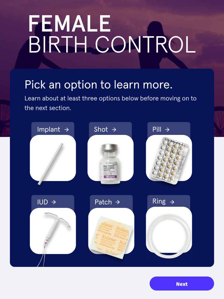

Part 4 focused on female birth control methods. Research showed that users were unfamiliar with many of these methods. A library showed detailed information on each one, allowing users to explore and learn at their own pace.
The Combinations screen showed how the using both a condoms and a female birth control method yields the best protection from unwanted pregnancy and STDs.
Squidelephant Animation Studios
As we neared the end of the design phase, we still didn’t know where the video content would be coming from for part 3. With a very limited budget it was clear hiring an outside vendor wasn’t possible, and we would have to get creative.
Using a web based animation platform called Vyond, I was able to create three videos in just a few days. I also recorded the voiceover, and sourced royalty free background music. While these videos are not as high quality as what an animation vendor could produce, they were good enough for the use case. More importantly, they were finished on time and within the budget.
Published Work
The Dr. Eric study came to an end in 2022. After analyzing the data, they found statistically compelling evidence that the app did in fact improved condom usage!
I helped co-author a paper with the Dr. Chernick’s team outlining our unique approach combining best practices from commercial app development and clinical behavioral health research. You can read it here.
“A User-Informed Phased Approach to Design a Digital Sexual Health Intervention for Adolescent and Young Adult Male Emergency Department Patients”
by Lauren Chernick, Mona Bugaighis, Victoria Daylor, Daniel Hochster, Evan Rosen, Rebecca Schnall, Melissa S Stockwell, David Bell